Hi @Durkin
Do you have an explanation about a recent UX update that removed one of the most valuable features, being the 30 day rolling average sleep metrics for REM, SWS, light sleep, and awake time.
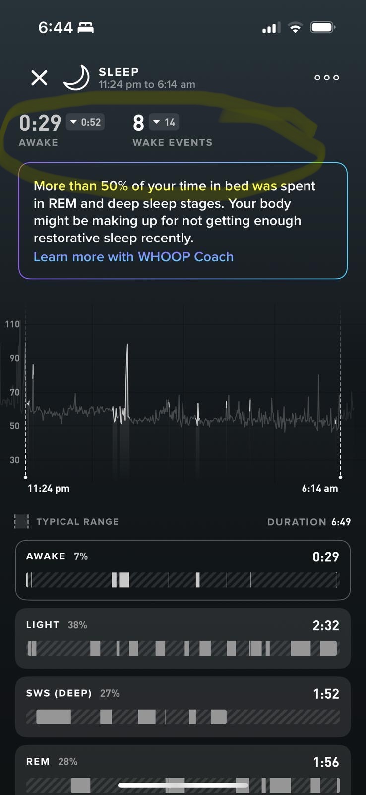
Attached are screenshots of what the old UX looked like v. new UX. That tiny up/down arrow with the 30 day ave rolling number showing how each stage was trending was something I looked at every single morning. It helped me quickly understand whether I was improving or regressing. I loved being able to glance at my REM and see, for example, that I hit 2hrs last night, up from a 1hr 25m rolling 30 day average. Same for awake time. Recently I’ve brought my awake time down significantly and seeing my rolling 30 day average come down was a fantastic feedback loop. Wake events 30 day rolling ave has also been removed.
While the dotted range lines remain, they offer no real context or clarity, they just don’t provide the same value. I honestly can’t understand why that small but awesome feature was removed. It’s really bugging me to understand the thought process here. I’m hoping it’s just an oversight with all the changes recently.
I raised this via email to WHOOP support but just got an AI slop generated response that can’t understand the nuance of my question/concern. As you’ll see from the screenshots, you have removed the 30 day average for sleep categories in terms of hard numbers. I want to know for example, I had 1hr of awake time last night but my rolling 30 day average is 41mins. Old UX was perfect for sleep.
Thanks in advance for a thoughtful response so I can get an understanding of whether this was an oversight in new UX rollout or if there’s a genuine reason behind removing this highly useful data.
Greg, member of 5+ years.